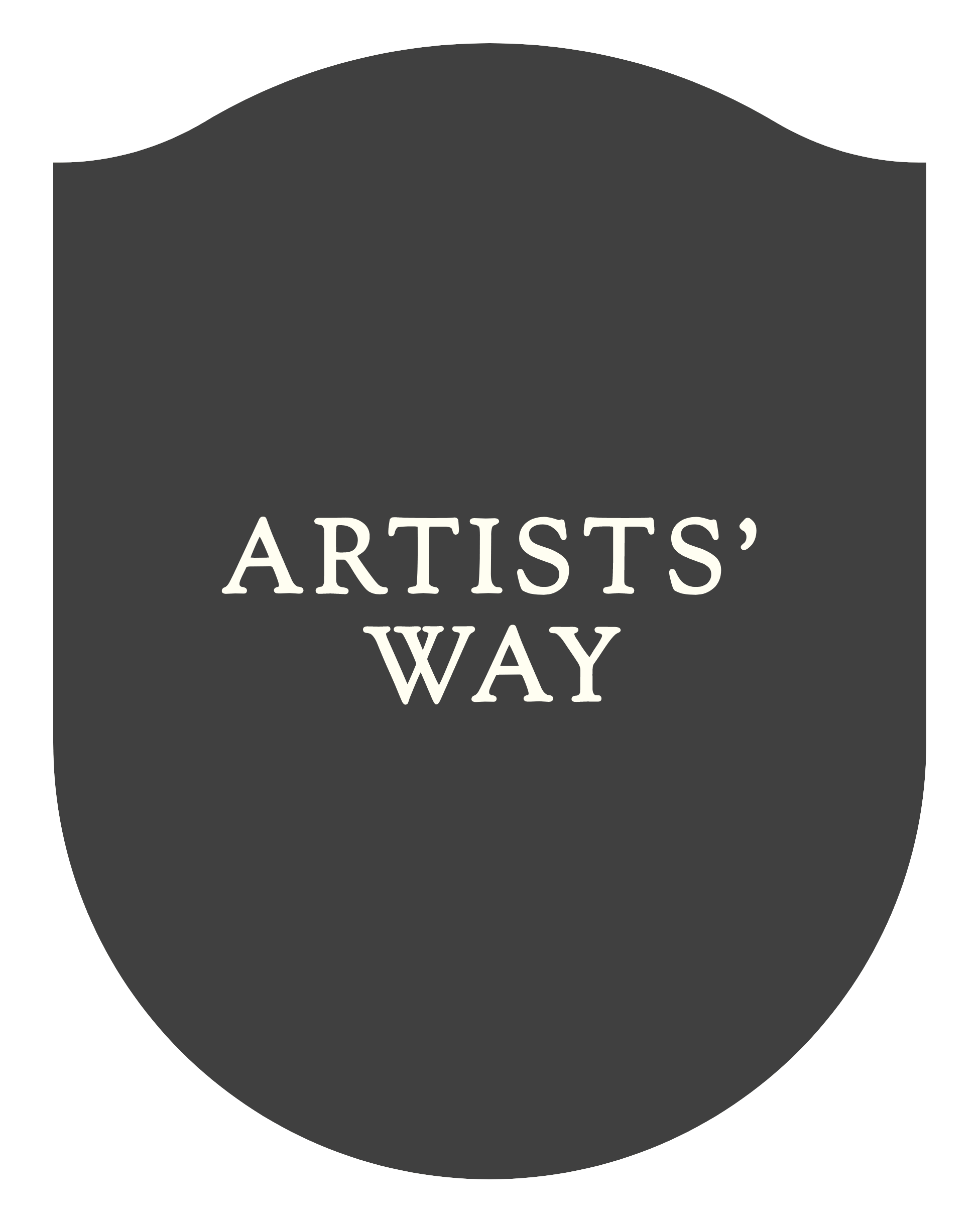
ARTISTS’ WAY
Artists’ Way is a holistic PR agency that aims to serve the musician and their story instead of the industry ego.
THE BRIEF
Create an identity that reflects the mission and commitment we will make to the artists we represent.
THE SOLUTION
A simple, flexible and distinctive identity that provides a framework to shine a light on the work the agency does and the artists it represents.
SERVICES
• Conceptual development
• Brand Identity
• Brand Architecture
• Art Direction
• Typographic design
• Social Strategy
https://artistswaypr.cargo.site/

THE CONCEPT
I went back to the essence of what Elspeth believed the agency would do – amplify voices of artists with open and honest storytelling and provide young creators the framework to promote their music in their own way.
I did a lot of research into heraldry (a broad term for the design and meaning behind crests and coat of arms) and then developed the idea of the ‘blank crest’. The concept of the crest is to represent Artists’ Way providing a framework (guidance, valuable insight and the tools) for creators to promote their music in their own way.
Listen to me explaining the concept in more depth:


Elsie!!!! I’m in love.
You know the inside of my mind. These look amazing. No words. What are the next steps? I’m SUPER happy. Thank you.
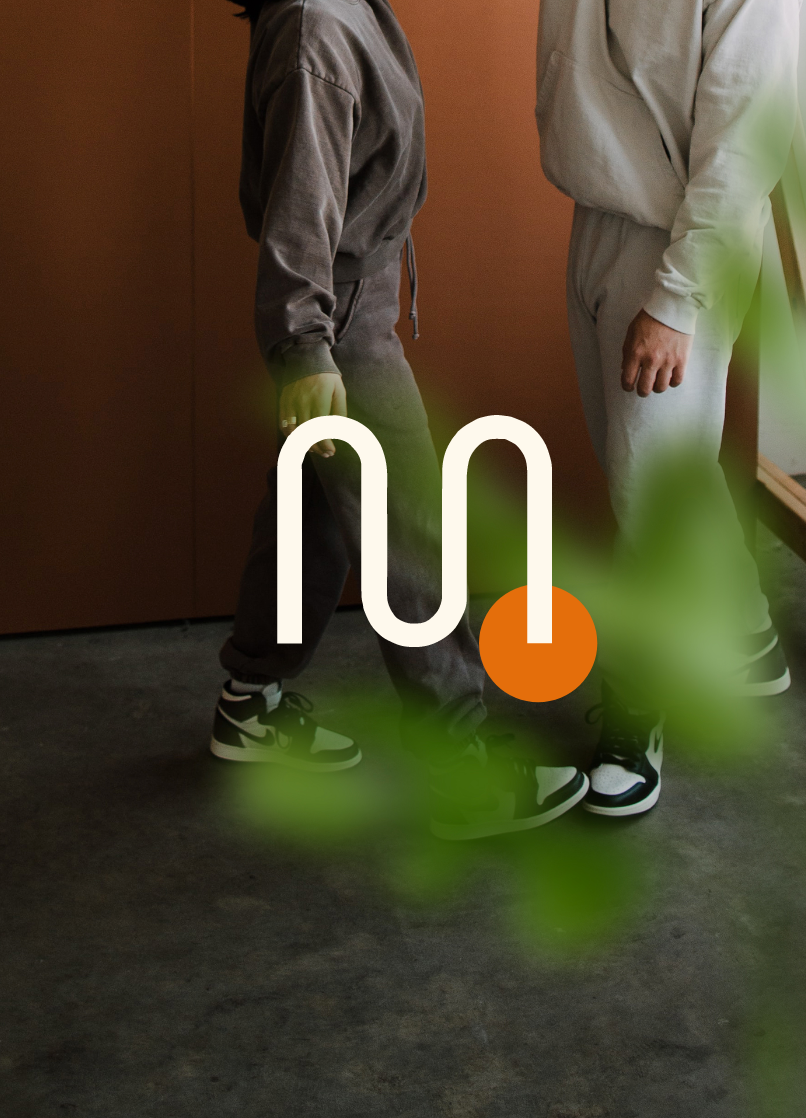
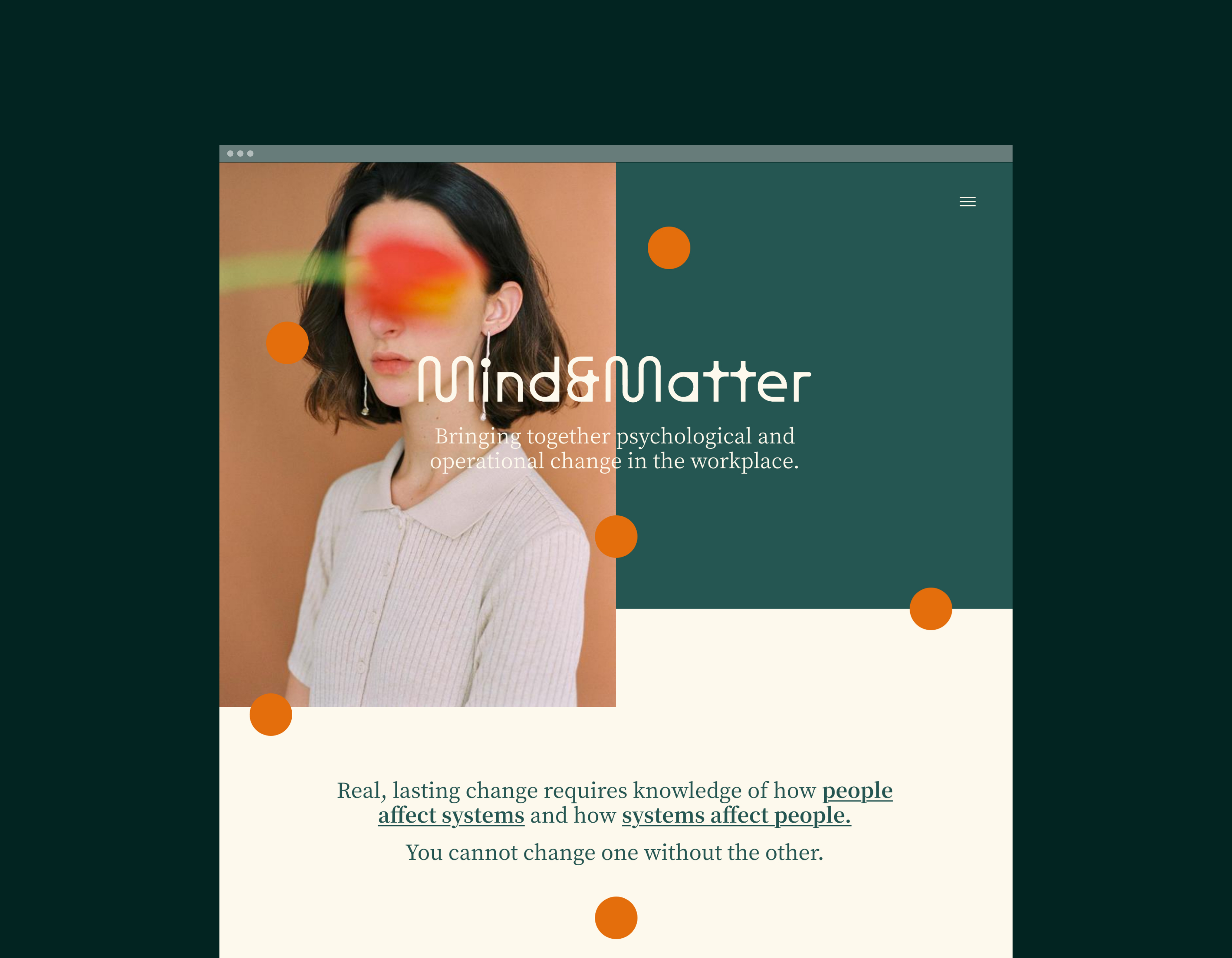
MIND & MATTER
Mind & Matter is a new kind of change consultancy. They understand the psychological and structural factors around restructuring roles, tasks, teams and processes.
THE BRIEF
Create an identity that reflects both people and change, is sophisticated, approachable and stands out to peers on LinkedIn.
THE SOLUTION
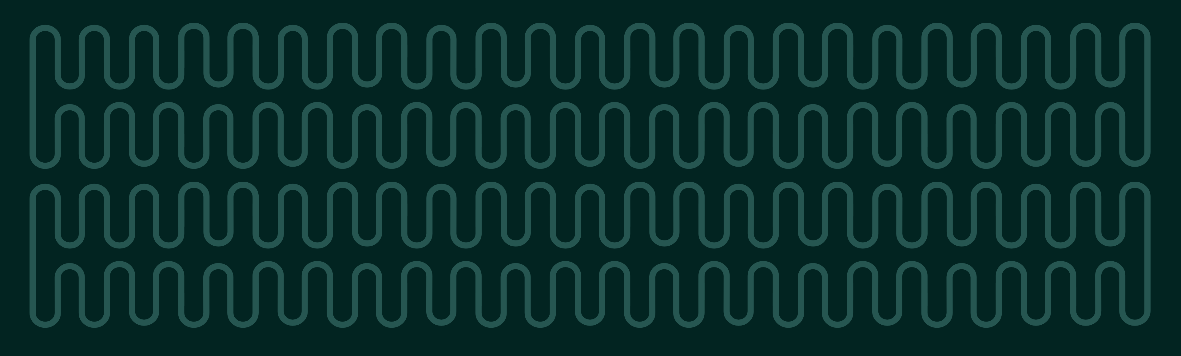
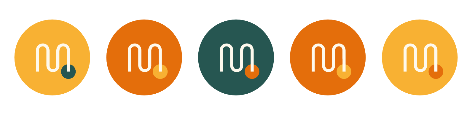
A dynamic and elegant brand that reflects change through typography and simple graphics.
In addition to the logo, I supplied an extended suite of elements that are interchangeable and regonisable so the brand can develop as the company does.
SERVICES
• Conceptual development
• Brand Identity
• Brand Architecture
• Photo Art Direction
• Web Design concepts
• Social Strategy
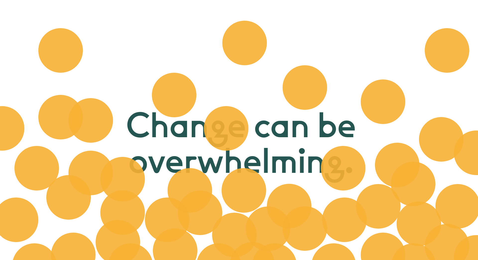
THE CONCEPT
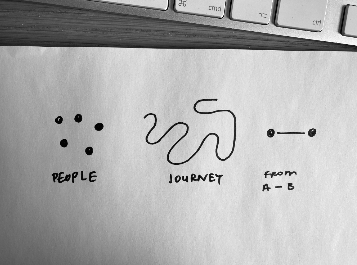
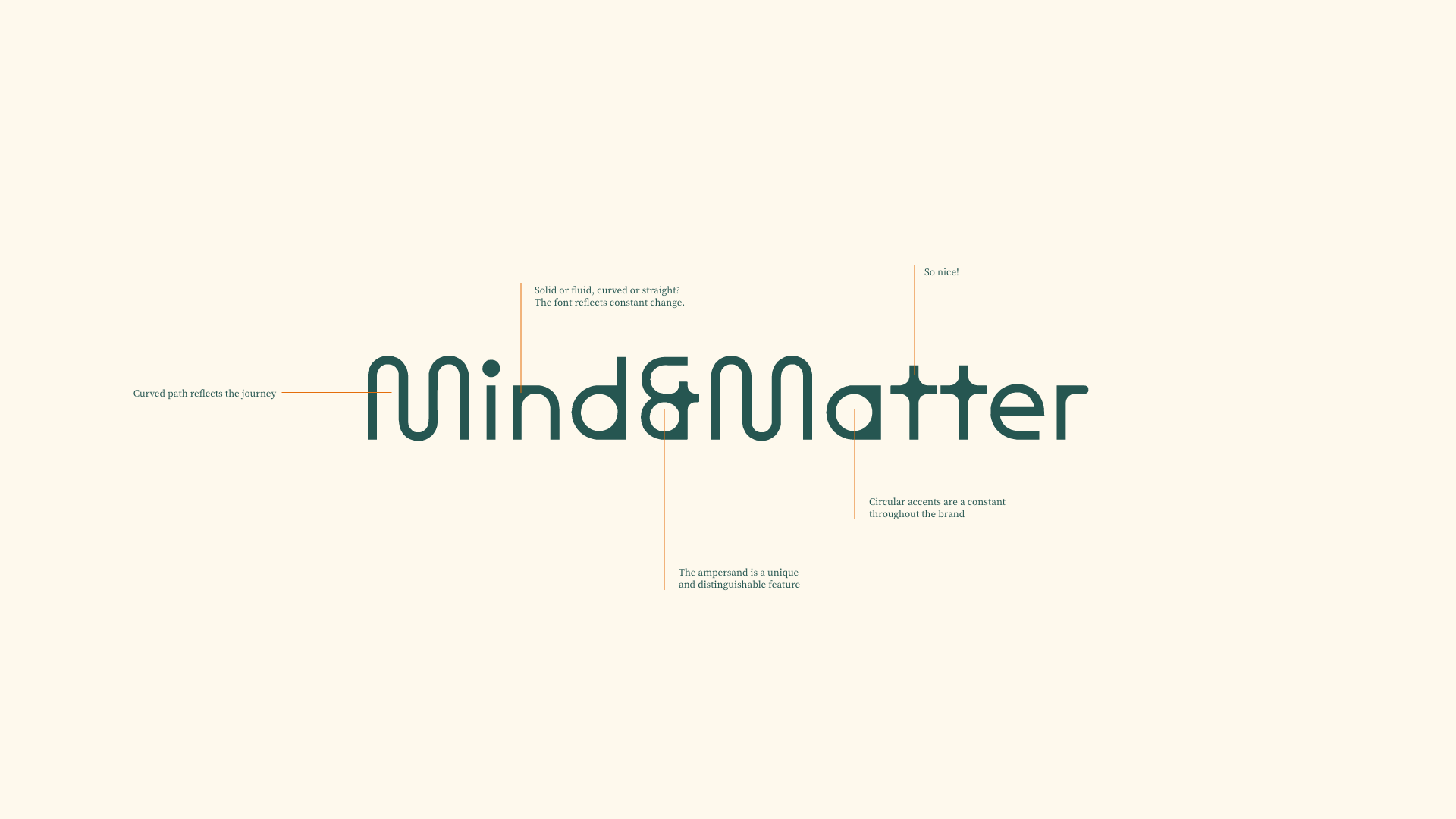
After talking with Andrew and understanding his process, it was clear that we needed to show the connection between people and the change they go through.
I simplified ‘people’ to a dot – which could be seen literally (birds eye view), or as a ‘head count’ in data. It was important that the journey wasn’t linear, but instead showed change of direction, up’s and downs.
The result is a combination of a brave client, the perfect font and some lush colours reflective of office layouts from the 1950s (Mad Men and Queen's Gambit era).
Listen below to my in-depth thoughts on the concept and other design decisions.


Woke up this morning... and still love it!! Thank you again so much Elsie.
Andrew Waddell
Founder, Mind & Matter
Honestly am so excited by the branding! Thalia (my wife) ADORED the look in its entirety! She said it was 'very you'!
Andrew Waddell
Founder, Mind & Matter
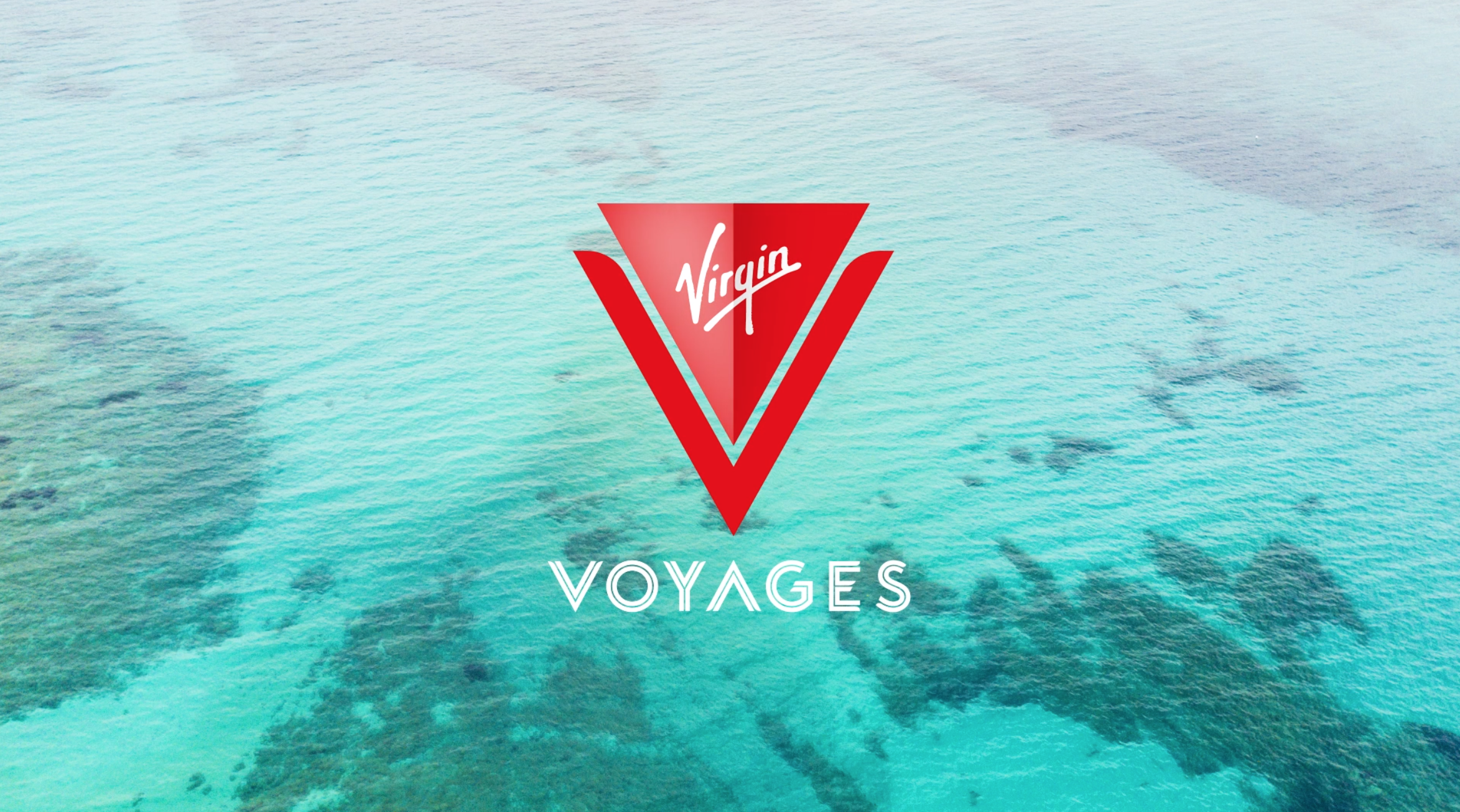
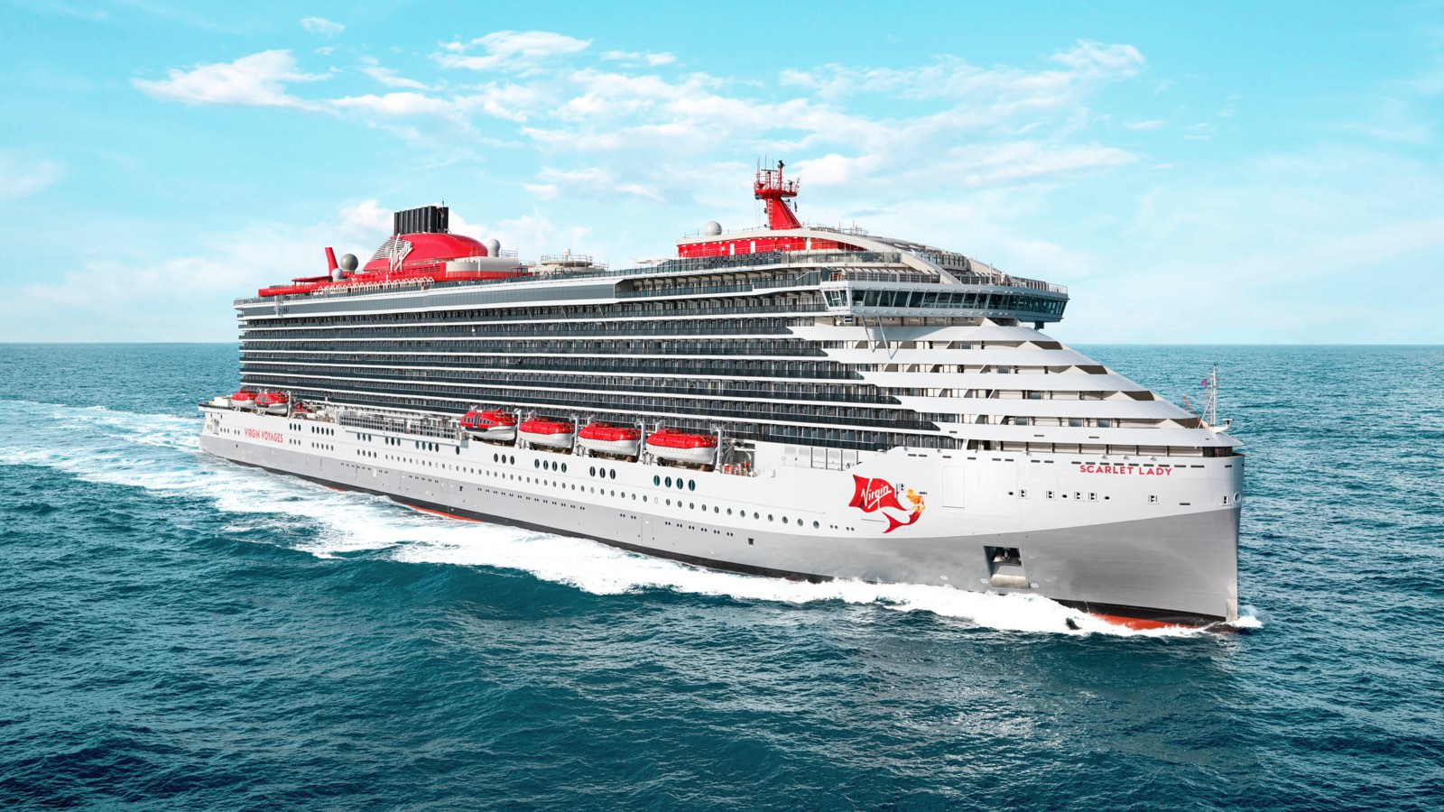
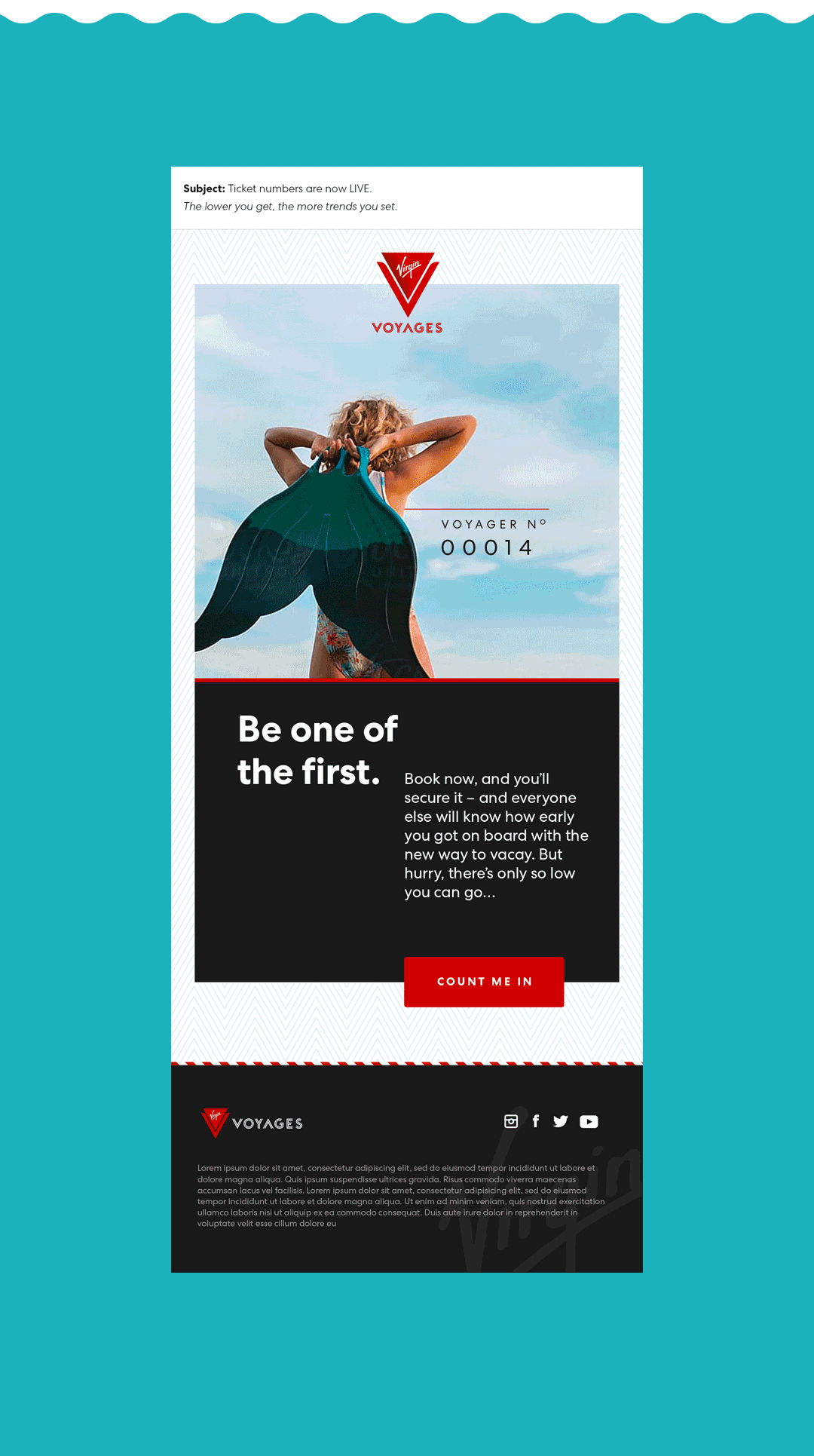
VIRGIN VOYAGES
Virgin Voyages is a new cruise line by Richard Branson. It’s purpose is to shake up the industry and ‘stray the course’. Adults only, bottomless brunches, spin classes, immersive theatre and even a tattoo parlour.
THE BRIEF
Create a digtal customer journey to inspire and reassure sailors in the build up to their voyage.
THE SOLUTION
Using data and tech we created custom communications to gamify and reward, our goal was to make admin a breeze and prepare the sailors for anything. We dialed down the stress and up the good stuff, inspiring them to customize and create a dream holiday they'd never forget.
SERVICES
• Conceptual development
• Design & art direction of emails
• Illustration
• Image sourcing and curation
Copywriting by Emily Ash Powell.
www.virginvoyages.com


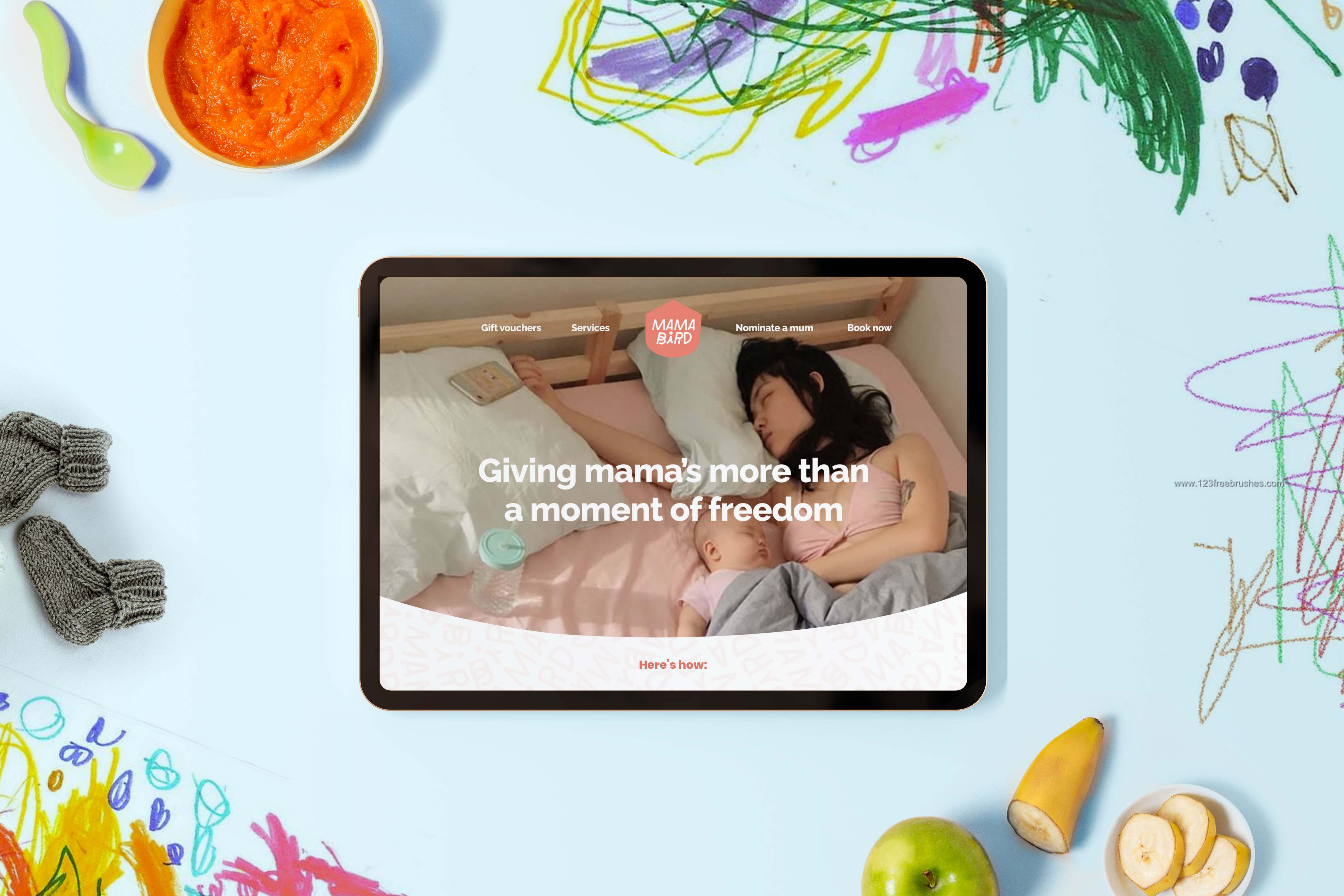
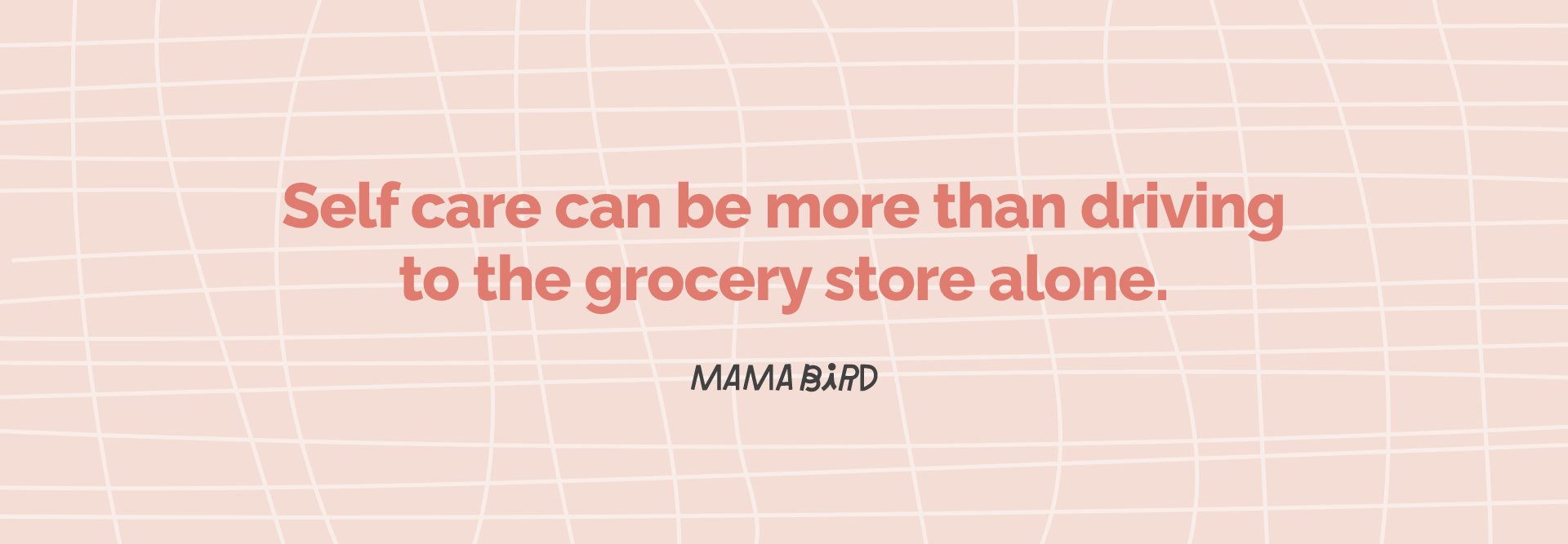
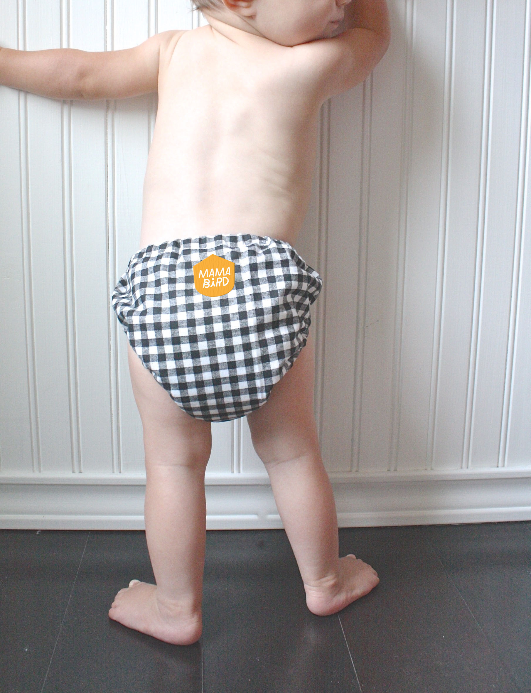
MAMA BIRD
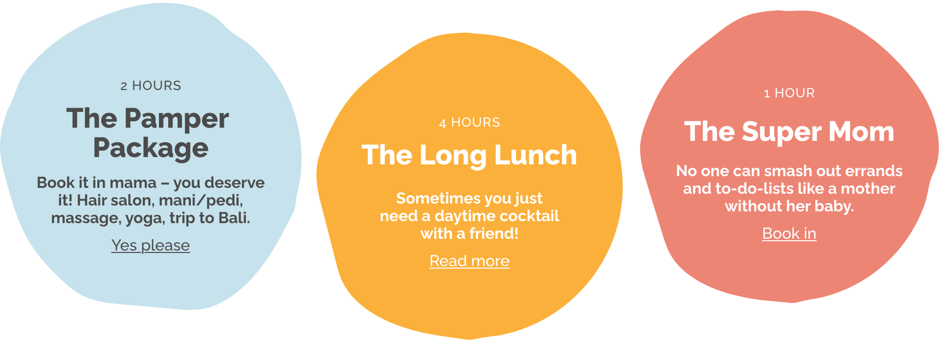
Mama Bird is a service set up to offer a moment of freedom or an extra pair of hands during the messy & magical first 6 months of motherhood.
THE BRIEF
Create a brand that is trustworthy, reflective of an organised environment but still has a sense of fun.
THE SOLUTION
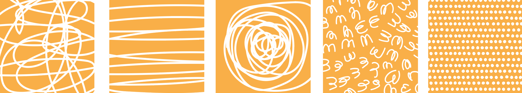
I developed a design for Mama Bird that has a personality you can trust. By combining illustrative patterns and the Mamabird ‘badge’ it creates the perfect balance of fun and function, chaos and control.
Tone of voice helped to bring personality into the brand and reinforce the supportive and understanding values of the company.
SERVICES
• Research
• Conceptual development
• Brand Identity
• Tone of voice guide
• Brand Architecture
• Web Design concepts
• Social Strategy


Early concepts:

Final conceptual idea:
THE CONCEPT
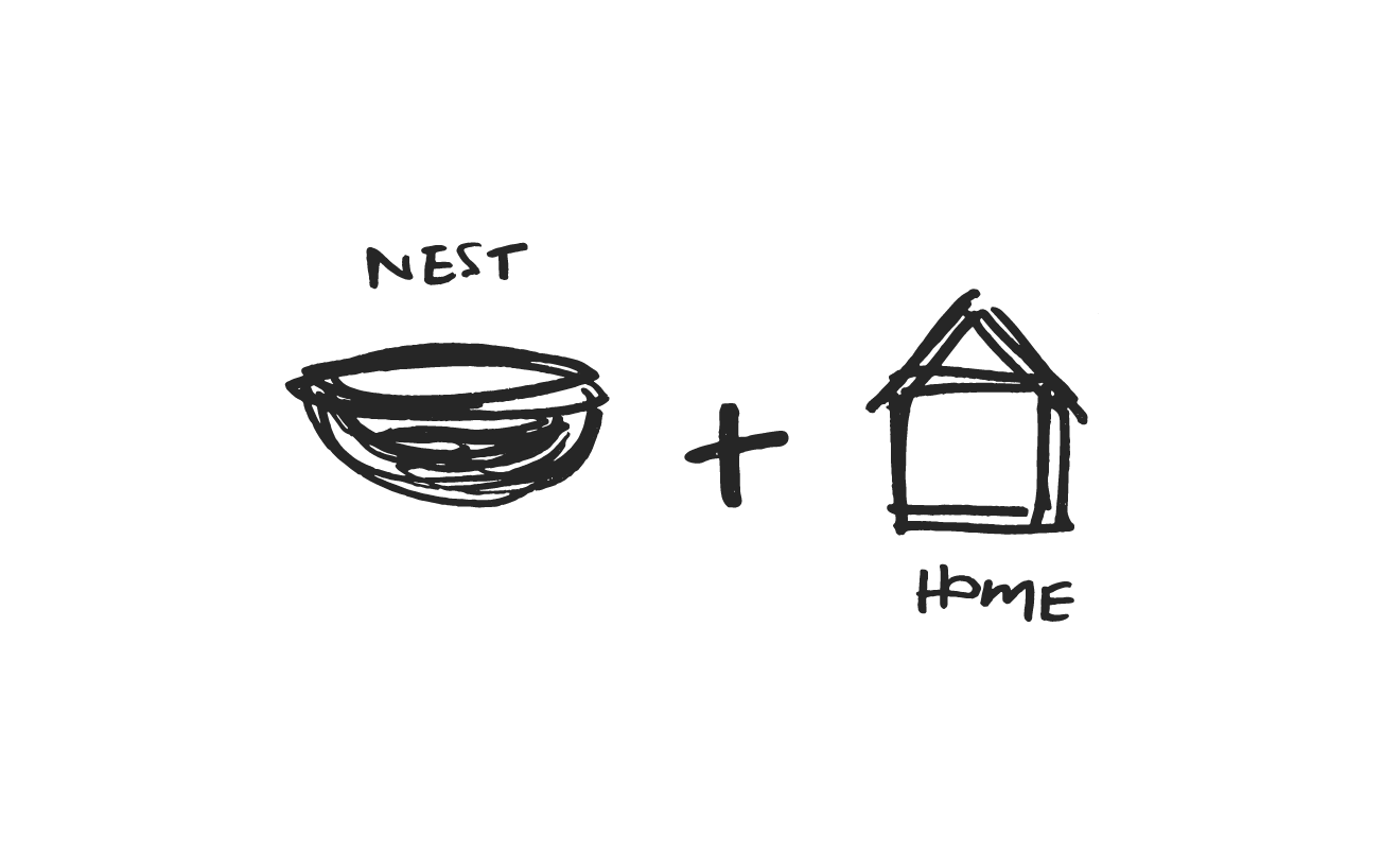
After being distracted by trying to draw the perfect motherly bird with big hugging arms, I switched tack.
I wanted the brand to be trustworthy and reflective of an organised environment, not just cute. I also wanted to create a recogniseable identity that had a real concept behind it to make Mama Bird stand out from a very gentle landscape.
The end result is a combination of both the nest and the home, to form a sort of badge that represents the stellar service that Mama Bird provides.


Omgosh Elspeth that’s amazing !! Yes yes yes. I wasn’t really sure how to bring my personality into it ...this is so perfect.
Claire Davy
Founder, Mama Bird
ROLLS ROYCE
I worked with the team at Profusion London to re-designed the entire CRM journey for Rolls Royce. This led to a huge increase in sales and uplift in customer loyalty.
This project is confidential so I don’t have permission to share the designs, but if you’d like to discuss the process or my role in the transformation, send me a message.


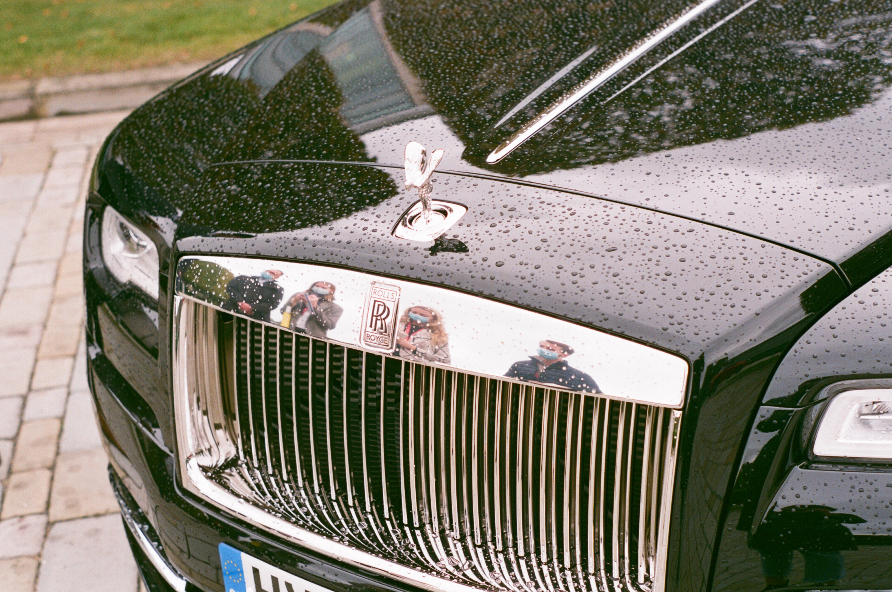
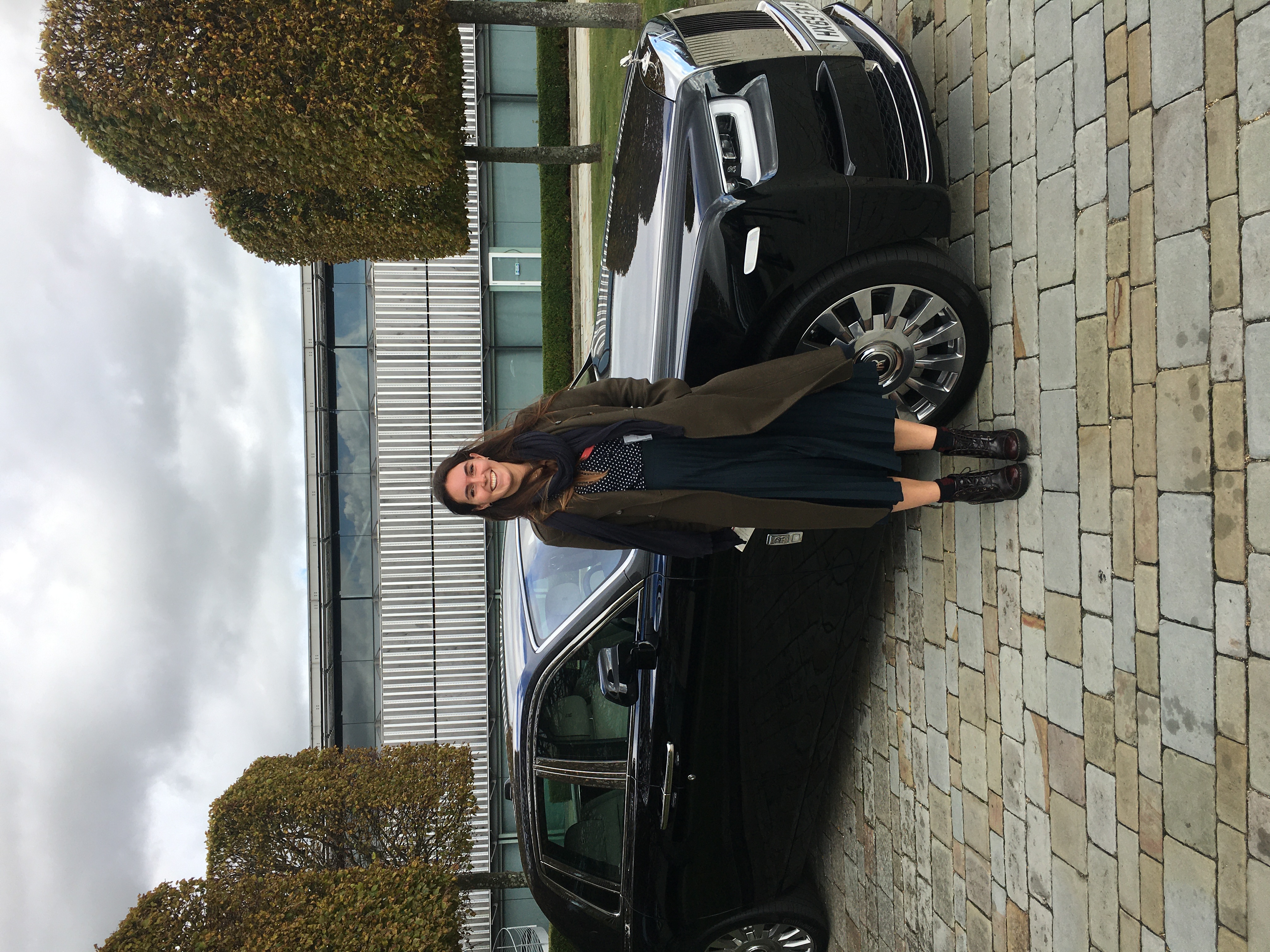 Infront of Phantom @ Goodwood
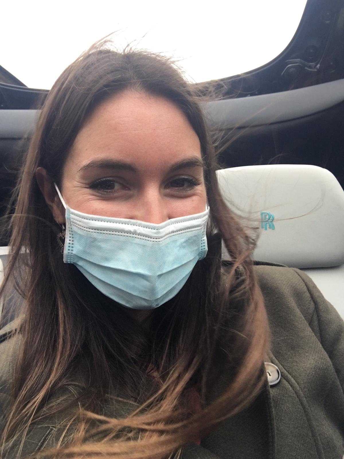 Test driving Ghost